Most Plumber Websites Look Identical — And That's a Problem
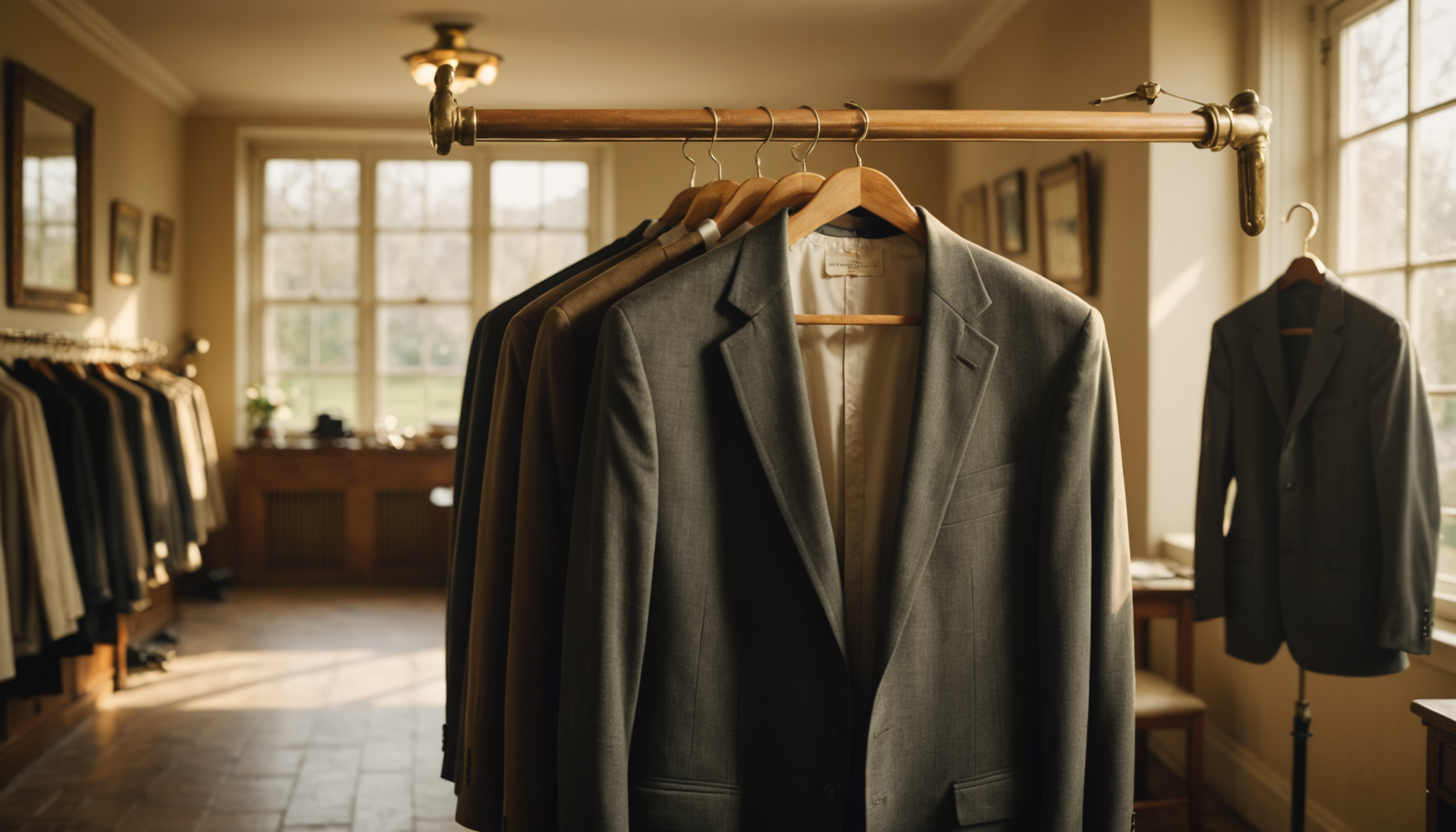
Blue color scheme. Wrench icon in the logo. Stock photo of a smiling guy in a hard hat. Bold headline that says something like "Your Local Plumbing Experts Since 1998." Sound familiar? That describes roughly 80% of plumber websites on the internet right now.
Here's the thing: when every business in your category looks the same, none of them look trustworthy. Instead of thinking "these folks seem professional," a potential customer thinks "wait, did I already look at this one?" You've become invisible — not because your work is bad, but because your website is forgettable.
Website differentiation isn't about being weird for the sake of it. It's about making sure the right person lands on your site and immediately knows they're in the right place — and that you're not just another generic option.
When Sameness Hurts Your Business
Let's be honest about what happens when someone is shopping around for a local service. They open four or five browser tabs. They skim each site. And then — here's the painful part — they can't remember which one was which.
If your site looks like the three others they just visited, you've handed that customer a coin flip. Even if you're the most qualified option, a forgettable website erases that advantage before you even get a chance to prove yourself.
The Clone Problem in Service Industries
It's especially bad in industries like:
- Plumbing and HVAC — blue palettes, tool imagery, "24/7 emergency" banners everywhere
- Real estate — white backgrounds, headshot-and-sold-sign layouts, generic taglines about "finding your dream home"
- Gyms and fitness studios — dark backgrounds, aggressive fonts, the same stock photo of someone lifting a barbell
- Bakeries and cafés — kraft paper textures, chalkboard fonts, the exact same pastel color story
None of these defaults are wrong, exactly. The problem is that when everyone uses them, they stop communicating anything meaningful about you specifically.
Sameness Signals "I Didn't Think About This"
Customers don't consciously notice when a website is a clone — but they feel it. A site that could belong to any business in your category quietly signals that you didn't put much thought into how you present yourself. And if you didn't think much about your website, what else didn't you think much about?
That's an unfair inference, but it's a real one. Small business branding is often the first impression a customer gets of your professionalism, your attention to detail, and your personality. A generic site wastes that opportunity.
When Sameness Actually Helps
Before you go fully off-script, it's worth understanding where convention earns its keep. Not everything on your website should be original — some things should be exactly what people expect.
Familiar Flows Build Trust
When someone wants to contact you, they expect a contact form. When they want to book an appointment, they expect a button near the top of the page. When they want to see your hours, they expect them in the footer or on an "About" page.
Break those conventions and you create friction. A visitor who can't find your phone number in three seconds doesn't think "how creative" — they leave.
The rule of thumb: be different in ways that express your personality, and familiar in ways that serve the customer's task. Your color story can be unexpected. Your homepage layout should still be scannable. Your photos can be genuine and specific to your business. Your contact form should still look like a contact form.
Industry Cues Still Matter
There's a reason law firms tend toward navy and gold, and smoothie bars tend toward green and white. Those color associations exist because they've been reinforced over time — they carry meaning. A law firm that goes full neon pink might stand out, but it's working against an expectation that exists for a reason.
The goal isn't to ignore category norms entirely. It's to use them as a starting point, then add the specific visual and verbal choices that make your business feel like yours.
What Actually Makes a Website Feel Unique
You don't need a massive design budget or a complete brand overhaul to avoid the clone trap. A few targeted decisions make a significant difference.
Real Photos Over Stock Photos
Nothing differentiates a website faster than actual photos of your work, your space, or your team. A stock photo of a smiling handyman could belong to any business. A photo of your actual truck, your actual tools, or the job you finished last Tuesday tells a story no competitor can copy.
Even decent smartphone photos beat polished stock imagery when it comes to authenticity. Customers can tell the difference — and they trust the real thing more.
A Voice That Sounds Like a Person
Most small business websites read like they were written by a committee in 2008. "We are committed to delivering excellence in all aspects of our service." Okay. Nobody talks like that.
Writing your website copy the way you'd actually talk to a customer — casual, specific, a little warm — immediately sets you apart from competitors who defaulted to corporate-speak. You don't need a copywriter. You need to write the way you'd explain your business to a neighbor.
Specificity Beats Generality Every Time
"We serve the greater metro area" is forgettable. "We've been fixing roofs in Westside neighborhoods since 2011" is specific, local, and memorable. "Quality work at fair prices" means nothing. "We answer every quote request within two hours, guaranteed" means something.
Specificity is free. It just requires you to think about what actually makes your business different — and then say it plainly on your website.
A Color and Font Palette That's Intentionally Yours
You don't need brand guidelines from a design agency to make considered visual choices. Picking two or three colors that feel right for your business personality — and using them consistently — creates a recognizable look that sticks in memory. Same with fonts: one strong, readable font used consistently is far more effective than a mishmash of whatever the template defaulted to.
How a Good Website Build Handles This Balance
Here's where things get practical. Most small business owners don't want to spend weeks agonizing over color theory or layout decisions. They want a site that looks right for their industry, reflects their specific business, and doesn't look like it was cloned from a template folder.
That's the balance a smart build process is supposed to strike: category-appropriate defaults that get you 80% of the way there, plus enough specificity about your actual business to push you the rest of the way into something genuinely yours.
Take a bakery site we built as an example. It reads as a bakery — warm, approachable, food-forward — but it doesn't look like it was pulled from a generic bakery template. The details are specific to that business. Or look at this gym site: it has the energy and directness you'd expect from a fitness brand, without defaulting to the same dark-aggressive aesthetic every other gym uses.
The goal isn't to reinvent the wheel — it's to make the wheel recognizably yours.
If you'd rather not make these decisions yourself, Hands Free Sites builds your site from scratch based on what you tell us about your business. We pick defaults that fit your category without making you a clone of every competitor in it — and since we're building specifically for you, the result reflects your business rather than a generic version of it. Setup is $99, hosting is $10/month, and you see a free preview before you pay a cent.
The Bottom Line on Website Differentiation
A unique website isn't a luxury — it's what separates a business that gets remembered from one that gets lost in a browser tab. The goal isn't to be the most unusual site in your category. It's to be the most you site in your category.
Use your industry's visual language as a starting point. Then layer in real photos, specific copy, and deliberate design choices that no competitor can replicate because those choices belong to you. That's what website design is actually for — not just to look good, but to make sure the right customer picks you.